The first version of the game was complete, and it was time for some testing!

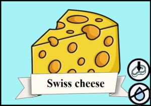
Once again, I utilized my Paint skills, perfected over 20 years, to design the first prototype of “Sandwich Showdown” (the project’s working title) graphically as well. I gave the ingredient categories different colored backgrounds, and with the help of ChatGPT’s image generator and Google Images, I created pictures for the 25 types of ingredients. I didn’t want to invest too much energy, I was aiming to give the cards the simplest illustrations, but this process still took about a week. Although the graphics were rudimentary, I tried to design the images in a way that would allow my tester friends and family to immerse themselves in the game’s world. A major lesson from testing the totem game was that because we place the cards overlapping and on top of each other in front of us (to save space and fit better on the table), only the bottom or top part of the cards remained visible after building a column. When I designed the totem animal cards, I hadn’t considered this, so it’s apparent that different parts of the cards contain relevant information: on the left, right, and bottom center (point value, species, size); and name at the top center, positional bonus in the top right corner. The fact that the names, illustrations, and other bonuses of the cards were not visible due to overlaps made counting victory points at the end of the game quite difficult. Before designing the sandwich game, I had already considered this problem and decided that all essential information should be placed at the bottom of the cards. In this game, the number of pictograms on the cards was reduced, I included only the ingredients’ moisture content and positional bonuses: so it wasn’t difficult to condense this information at the bottom. Initially, these two pieces of data were placed on the bottom right, with the ingredient names in the center. I also changed the orientation of the card illustrations (rotated them by 90°) because the totem game’s illustrations’ bottom part were the only things visible due to overlaps, which detracted from the appearance of the table layout.

Another aspect that differed in the sandwich game: every card had the same base point value (1). In the previous game, rarer cards were worth more points than common ones, and this felt like poor game design even after three matches, because when there was a choice between a 3-point and a 1-point card in the draft pile, in 90% of cases there was no reason to choose the lower-value card, except perhaps for a high-scoring synergy 10% of the time, so players had many automatic decisions without the need to think in such situations. By having the cards fundamentally worth the same amount of points, the combos between them primarily determine which ones we should choose, and this also allowed for the removal of a pictogram that took up space on the cards.

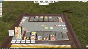
I knew that if I wanted to test the game with others too not just my wife, it would be advantageous to have an online playable version. This way, it would be easier to organize a 30-minute to 1-hour test session with friends who are less available due to work, family, lack of time, or distance. Another advantage of the online prototype is that it’s much easier to make changes to the game; moreover, printing and cutting out the 200 cards of my game could take 1-2 hours. Not to mention, if modifications on those need to be made, it requires additional printing and cutting. Fortunately, during the game design course, we were introduced to a fantastic program (more like a PC game): TableTop Simulator (TTS). In short, this program allows us to create an online playable version of any physical board game, whether it’s card games, board games, or even a game that uses gravity like Ghost Castle. At first, the interface and controls might seem cumbersome, deterring many from its use, but once you get the hang of the simulator’s ins and outs, you can quickly simulate any board game. While searching for tutorials on YouTube, I came across Ludo Lodge‘s instructional videos for TTS and, after a day or two of trial and error, I quickly became quite good with the software. Some aspects of the program can only be executed through programming, which I have very minimal knowledge of, unfortunately. However, one of his videos showcased a script that allows for dealing cards from a deck to the center face-up; exactly what I needed! My graphics created in Paint could be relatively easily imported into the game, and in minutes, I was able to create decks from them. To my delight, after a few days of tinkering with TTS, the online playable version of my game was completed, even before the physical prototype. Thus, the testing phase could begin, and fortunately, my friend Robi was up for it, so in mid-January, we played our first matches!
After playing the first few games, I felt significant improvements in the game’s atmosphere and its mechanics; in my opinion, the mechanics and theme perfectly matched each other. My first test partner, Robi, has been comfortable in the world of games for a long time, so he could provide a lot of constructive and honest criticism about the game. After brainstorming together, we unanimously agreed that the game felt a bit too much like solitaire, with everyone building their little things, but aside from hate drafting, there was little interaction between players. I originally knew I wanted to add various modifiers to the game, but the fact that he also thought it was necessary to develop the “base game” was great feedback for me. Even on that occasion, some ideas were born that have since become an integral part of the game, to mention a few:
- Choosing/drawing a chef character at the beginning of the game; each character has different abilities.
- Action cards that can be played from hand during the game.
- End-of-game bonuses/achievements.
- Interactions with the “Bin/trash”.

Armed with these new ideas, I continued down the challenging path of game design, some Excel spreadsheet-tinkering and creative thinking were ahead of me in the coming days. Meanwhile, I tried to rally as many friends and family members as possible for some testing, this time with a physical prototype. I had about two weeks to arrive at the end-of-course workshop with a more polished version and some testing sessions under my belt to report on. During this period, I managed to design 8 chef characters and 15 types (20 in total) of new action cards, graphically designing them with Paint and generative AI, then sizing them to the dimensions mentioned in the previous post for the “Hatalom Kártyái” cards, and finally printing out the 228 cards. We also managed to organize the first not 2, but 4-player game session at the Vault 51 gamer bar in Budapest with my wife, Robi, and my friend Marci. Here, I faced a minor setback: I had unnecessarily printed and sleeved this multitude of cards: the game was unplayable with cards of such size; there was no way to fit them on a regular 4-person table! Forcontext: these cards were 65*90mm in dimensions. In a 4-player game, about 30-40 cards are distributed on the table as a draft pile each round, and the sandwiches collected by the players in front of them (up to 7 sandwiches according to the rules) also take up quite a bit of space if the cards are that large. It was quite disappointing that 3-4 hours of work and the entire test session went to waste, but I didn’t get discouraged; it was just a minor hiccup on the journey. After returning home that evening, I reviewed the board games on my shelves to see which ones used small-sized cards and how legible they were to the naked eye. After some searching, I found the “Settlers of Catan” cards, which are 67*44mm, at least in our version. The indices in the corners are perfectly visible, and the text on the cards, although quite small, is clearly readable. I distributed a number of them on the table appropriate for my game and also set up columns of 6-6 cards high in front of me (with sandwiches usually consisting of bread-4 ingredients-bread as per the rules). Everything fit perfectly :)! This size will be the one.

Recalculating how many such cards can fit on an A4 sheet, creating new print sheets, reprinting, recutting, ordering Catan-sized card sleeves, inserting the printed sheets + Catan cards (to allow for shuffling), cutting more than 100 Catan-sized cards from HKK cards (since Catan only has about 120 cards in total), creating and printing back covers for the cards according to ingredient categories. These tasks filled every bit of free time in the days following the failed test at Vault. Once these were done, I quickly managed to organize another test session with the same group, and this time, my friend Marci’s wife, Fanni, joined us too, which I was particularly happy about. Beyond the fact that she is a fun person to be with, she counts as an absolute casual (non-gamer) player compared to my slightly nerdier friends and might be less biased than my wife, who is also relatively casual. This gave me the chance to show the game to someone who is part of its primary target audience. Obviously, one person’s opinion isn’t statistically significant, but you have to start somewhere, and even from one person, it can become clear if, for example, the game rules are hard to understand or something like what a player should do in the game. The game session went in a great atmosphere; we managed to play 2 matches, and naturally, a few minor technical issues with the game arose, but overall, my friends played smoothly and understood everything. Most importantly, everyone enjoyed the game! Also, on this occasion, storing the cards organized within the decks posed no problem. The large cards from the 1st prototype nearly took up an entire shoebox, but these smaller cards could have also caused trouble if my friend Bence, who is very experienced in 3D printing, hadn’t helped me out with a 4*2 compartment card holder designed specifically for this game. Seeing this card holder for the first time was quite a touching experience for me because, after I packed the categorized cards into the compartments, it looked like a real board game, and for the first time, I felt that this project could indeed come to fruition if I devoted enough effort to it.

Armed with these initial successes, I arrived at the last workshop of the board game creation course, where we had to present our project to one of the instructors. We were required to prepare a detailed rulebook and talk about our game, the lessons learned from testing, and our experiences using a PowerPoint/Prezi/Canva presentation, in exchange for valuable feedback and critiques from them. In the days leading up to the presentation, my project was still running under the name Sandwich Showdown, and it was only then for the first time that I decided what the game’s actual setting should be: who are the players, what world are we in, and what is our goal in the game? While walking my dog, inspiration struck out of nowhere: since the game already featured famous American-style sandwiches (for which extra points are awarded), the game’s setting could be a popular New York deli shop, where players take on the roles of sandwich masters competing to impress the owner and boss who is about to retire and is looking for a successor to entrust the shop to, measuring the employees’ skills within the framework of a competition. I had been struggling to settle on this for weeks, but once I had this idea, I felt like I had arrived at the perfect theme. In light of this, I definitely wanted the title to include the word “deli,” directly hinting at the theme. After mulling over several name ideas, the title of my course’s final exam project became “Deli Dash.” The term “dash” is used in certain contexts for fast-paced races, which I thought fit the game well since a match can be played relatively quickly within 25-45 minutes, and the sequential drafting of cards adds a fast-paced feel and atmosphere to the game. The person I presented to was none other than Győri Zoli (Mit játsszunk? vlog-Hungary’s most popular board game related YT channel). It was a truly special and amazing feeling that Zoli particularly liked my concept, had a very positive opinion about it, and even said he would like to try it out. This praise, along with the positive opinions of my friends, has been ringing in my head ever since, and I’ve spent the majority of my free time over the past two months further developing the game because I’ve decided to try to bring it to a marketable state and publish it. When the course started in November, I wouldn’t have believed that the world of board game design would captivate me so much, but I’m very happy that it ignited a passion within me that I’ve been pursuing with great enthusiasm every day since!
To be continued… Stay tuned for the next post, in which I plan to write about the period between the end of the course and the creation of the website, and I would introduce my game in detail, which has since been renamed to “Clash in the Deli”!
